
Thank you for reading the next part of my series on building great dashboards with vRealize Operations Cloud. In part 1, 2 and 3 of this series we already talked about various aspects of building dashboards in vRealize Operations and/or vRealize Operations Cloud:
- I’ve introduced the dashboard capability of vRealize Operations Cloud cloud and I’ve talked about some important questions you should ask yourself when start building dashboards.
- We also had a look at the different widgets and views that are available, and we learned how to configure widgets.
- We touched on the topic of interaction within dashboards and had a look at the Resource Interaction XML File.
In part 4 we will build an additional dashboard that will provide you a high level overview of your environment on the VM and ESXi host level. The auto-rotation option of vRealize Operations Cloud. will automatically rotate between the two dashboards we’re going to build.
Build great dashboards with vRealize Operations Cloud series – contents
Create the VM overview dashboard
For the first overview dashboard we will use two widgets we haven’t used so far. We’re going to use the scoreboard and heatmap widgets to build a virtual machine overview dashboard:
- The scoreboard widget allows you to create a nice overview of key metrics, most of the time used to get a better high level understanding of your environment.
- The heatmap widget is a very powerful multi-dimensional widget that allows you to monitor two metrics at the same time. We will dive a little deeper into this, in this article.
The high level structure of the dashboard is as follows:

The scoreboard will show some key metrics on the number of VMs that are running, while the heatmaps display CPU/Memory/Network/Storage metrics for the running virtual machines.
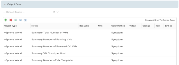
If you want to provide an overview of all the VMs in your environment (in the scoreboard widget), independent of the available datacenters and/or clusters you have to use the available metrics under vSphere World. Some interesting metrics to include in the dashboard widget are:
Of course you can also use a resource interaction XML file to set these objects/metrics as explained in one of my previous articles on vRealize Operations.
You can configure threshold values for the different metrics, this will change the dashboard color for the specific metric. In the example I’ve not configured any threshold values.
The basic configuration for this widget is as follows:

So:
- Self Provider = on
- Refresh Content =on
- Box Columns = 5
- Visual Theme = Opaque
- Add a sparkline to “Show”
- Period Length = 24 hours (of another period you would like to see).
Now let’s configure both heatmaps. Four heatmaps will be configured:
- Heatmap CPU will display number of vCPUs per VM and CPU usage (%);
- Heatmap Memory will only show memory usage (%);
- Heatmap Storage wil show consumed bandwidth and consumed IOPS (both read and write)
- Heatmap Network will only show network usage (in KBps – not Kbps).
Each heatmap will have Refresh Content and Self Provider configured. Because I only want to show information of VMs that are actually running, and advanced filter is configued on each heatmap that will only include powered on VMs:

Some heatmaps will show two dimensions (two different metrics), while other heatmaps will only show one metric. Let’s have a closer look at the CPU heatmap and dive a little deeper into the configuration:

In this example we’re grouping the VM objects first on a per Datacenter basis, then on a per vSphere Cluster basis (called Cluster Compute Resource in vRops/vRops Cloud). The next step is to configure which metrics you want to use, in this example “Number of CPUs (vCPUs)” for the size and “CPU Usage (%)” for the color. You can configure a min and max value, or leave it blank if you want vRealize Operations (Cloud) to determine min/max values automatically. In this case the min/max values will be determined based on the available values in the dataset (in this case the VMs). Because I’m monitoring VM CPU usage which goes from 0-100%, I configured these values so I am sure we get a full (coloring) scale.
For the configuration of the other three heatmaps I refer to the download of the dashboard available at the end of this article. You can import the dashboard and review the heatmaps configuration yourself. Note that for the heatmaps that use a metric that monitors the throughput, you might want to configure a min/max value yourself – depending on what are “normal” values for your environment.
After configuring all the heatmaps, the dashboard will look like this:

This dashboard is now finished. Let’s create a second dashboard that is based on this one but fill focus on how my ESXi hosts are running.
Create an ESXi hosts overview dashboard
To not start all over again, simply clone the dashboard we’ve just created. The clone option is available in the Managed Dashboard option in vRealize Operations Cloud. Clear the cloned dashboard and configure the appropriate host level metrics. Actually this redoing the process we’ve just discussed, although you need some other metrics here. I’ve included the dashboard at the end of this post so you can see for yourself which metrics should be included.
It will look like this in your vRealize Operations environment:

Configure the auto-rotation
So let’s now configure the auto-rotation between these two dashboards. This is a pretty straight forward process.
Choose dashboard, manage dashboards:

Now choose Auto-rotate dashboards:

And then create the auto-rotation configuration:

Now open one of the dashboards and the auto-rotation will automatically start. Display the dashboards on a big screen in your operations room, and you’re ready to go!
That’s it, if you want to download the dashboards you can find them here:
I hope this was helpful.


1 Comments
Pingback: vExpert Cloud Management May 2021 Blog Digest - Möbius Business Technologies Ltd.